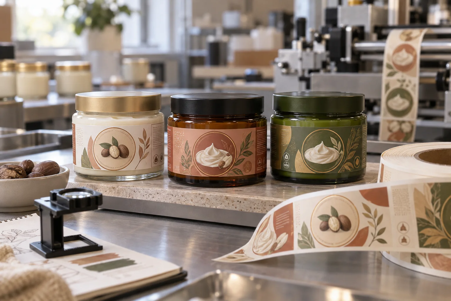
Start with the jar's stable sidewall
Measure the usable wrap area between lid overhang and base curve, then check the container seam and any taper. A label can fit the circumference and still look strained if it pushes into a part of the jar that will not stay visually flat.
Use product icons that earn their place
A shea-nut motif, cream swirl, botanical branch or soft texture mark can anchor a body-butter range without copying anyone else's packaging. Use one original icon family to distinguish variants, while the product type stays easy to find.
Let materials carry part of the story
Glass, matte PET, metal lids and a visible cream texture already create tactile signals. The label should organise them, not compete with them. One strong front panel, a colour field and a restrained information zone usually do more than a crowded wrap.
Choose construction for oils and wet hands
Body butter jars may meet moisture, oils and repeated opening. Film labels and protective finishes may be considered for durability, but final material choice should be tested against the jar surface, formula, storage and application workflow.
Plan the lid as a supporting panel
A round lid label can carry a scent or variant cue, but it does not need to repeat the entire side label. Give it a simple icon, colour ring or collection marker so stacked jars remain easy to identify.
Proof the set, not one jar
Review the jar from front, side and top alongside the other variants. Supply jar dimensions, artwork, finish preference and quantity. For another rich body-care format, see our body scrub jar label guide.
Need body butter jar labels?
Share your jar details, artwork and quantity for practical label options and a free digital proof.
Request a Body Butter Label Quote