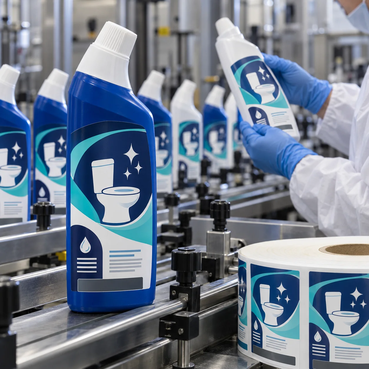
Map the front panel before designing it
Measure the usable front face on the actual filled bottle. The angled neck, curved shoulder and lower base can distort a large rectangle. A centered proof may look skewed after application if it ignores the bottle's changing width.
Use icons to make the product legible
A simplified toilet, sparkle, droplet and shield icon can help the package explain itself without copying a brand. Combine those cues with a strong color structure and a clear product-identification panel. Icons support the reading path; they do not excuse an overcrowded front.
Keep pack variants on one grid
Different bottle sizes or product directions benefit from the same core layout. Change the color band or icon emphasis, not the whole structure. That discipline matters during proofing and makes a range easier to recognize on a busy shelf.
Choose durable construction
Home-care bottles can encounter moisture, product drips and repeat handling. Film labels are commonly considered for these conditions, while the adhesive and finish should be selected around the specific bottle resin, fill and storage conditions.
Plan the required copy separately
Directions, safety handling and market-specific content should be reviewed by the responsible team. Give them a deliberate back or side information panel so the product-facing front can stay readable and credible.
Confirm the roll format before print
Share bottle measurements, label position, artwork, quantity and application method. Confirm orientation and unwind direction with the actual equipment. For another shaped household-cleaner bottle, see our window cleaner label guide.
Need toilet cleaner bottle labels?
Send your bottle details, artwork and quantity for practical material options and a free digital proof.
Request a Toilet Cleaner Label Quote