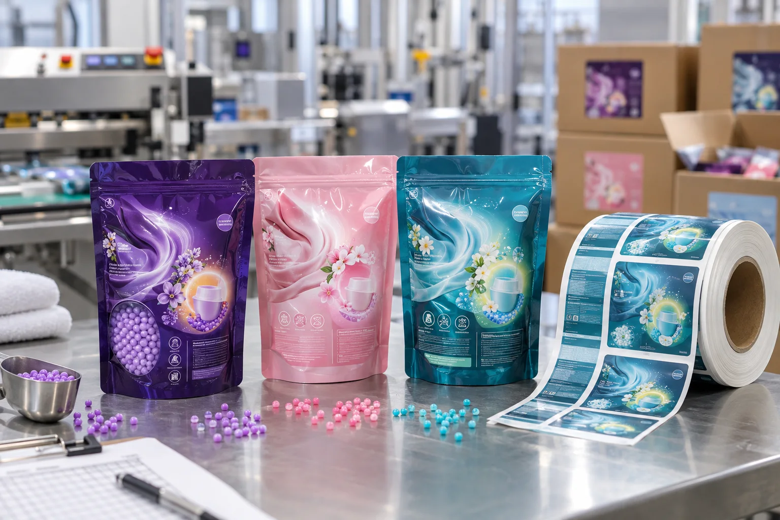
Start with the filled pouch silhouette
Check the top seal, gussets, zipper and the front zone that stays flat after filling. A pouch can look perfect empty and become visually crowded as soon as its contents settle into the bottom corners.
Build scent recognition with an original icon system
Fragrance waves, small flower clusters, bead illustrations and a measuring-cap mark can create a clear original system. Use the same layout grid across variants, then let colour and one controlled symbol explain the difference.
Use a clear window strategically
If the pouch shows the beads through a small window, that window is already telling part of the story. Keep the main label clear of it and make the graphic field support the product rather than obscure the physical detail buyers came to inspect.
Separate product hierarchy from final information
The front needs to establish the variant and format; remaining information needs planned space elsewhere. The responsible team should confirm final market-specific wording. A complete label system makes that detail readable instead of treating it as an afterthought.
Check film and adhesive against the pack
Flexible pouch surfaces and storage conditions affect how labels perform. Film materials and protective finishes may be considered, but final selection should be tested against the pouch laminate, filling process, scent materials and application method.
Proof a full colour family together
Review every variant side by side, then check the pouch at its filled shape. Supply pouch dimensions, artwork, finish preference and quantity. For another laundry pouch format, see our laundry pod packaging label guide.
Need laundry scent booster labels?
Share your pouch details, artwork and quantity for practical label options and a free digital proof.
Request a Scent Booster Label Quote