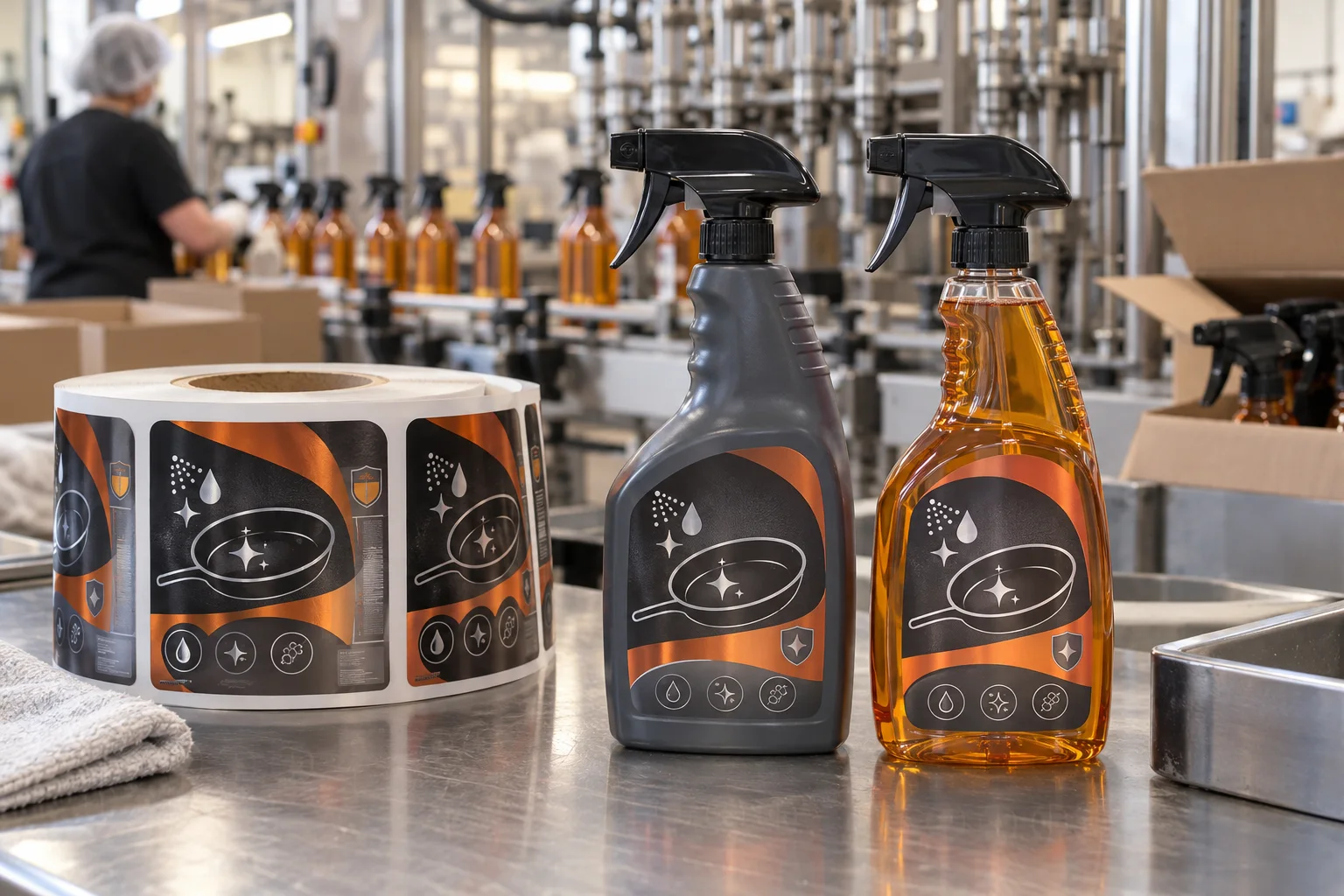
Measure the bottle around the hand grip
Map the trigger clearance, curved shoulder, grip recess and stable front zone before finalising artwork. If the label runs into a high-touch area, it can become harder to read long before the customer reaches the back panel.
Use original graphics to signal the category
A cookware outline, grease-sparkle mark, spray droplet and restrained shield icon can make the category obvious without borrowing a competitor's packaging language. Pair the icon family with strong colour blocks and an orderly front-to-back hierarchy.
Separate design from required information
Keep the front focused on recognition and leave a planned information panel for the final details supplied or approved by the responsible team for the target market. A label looks more credible when the layout admits that different information needs different space.
Choose materials for splashes and abrasion
Kitchen cleaners face water, oil residue, product contact and repeated wiping. Waterproof film labels and protective finishes are common considerations, but the final choice needs checking against bottle resin, formula, storage and the actual application process.
Confirm roll direction with the line
Roll orientation, gap and label position are production decisions, not finishing touches. Confirm them with the applicator workflow before print. It is usually the least glamorous question in the meeting and the most expensive one to guess.
Review the bottle where it will be used
Check the proof in the hand, on a shelf and near other cleaner formats. Supply the bottle details, artwork, finish preference and quantity. For another trigger format, see our cleaning spray bottle label guide.
Need kitchen degreaser labels?
Share your bottle details, artwork and quantity for practical label options and a free digital proof.
Request a Degreaser Label Quote