Check the usable panel on the real bottle
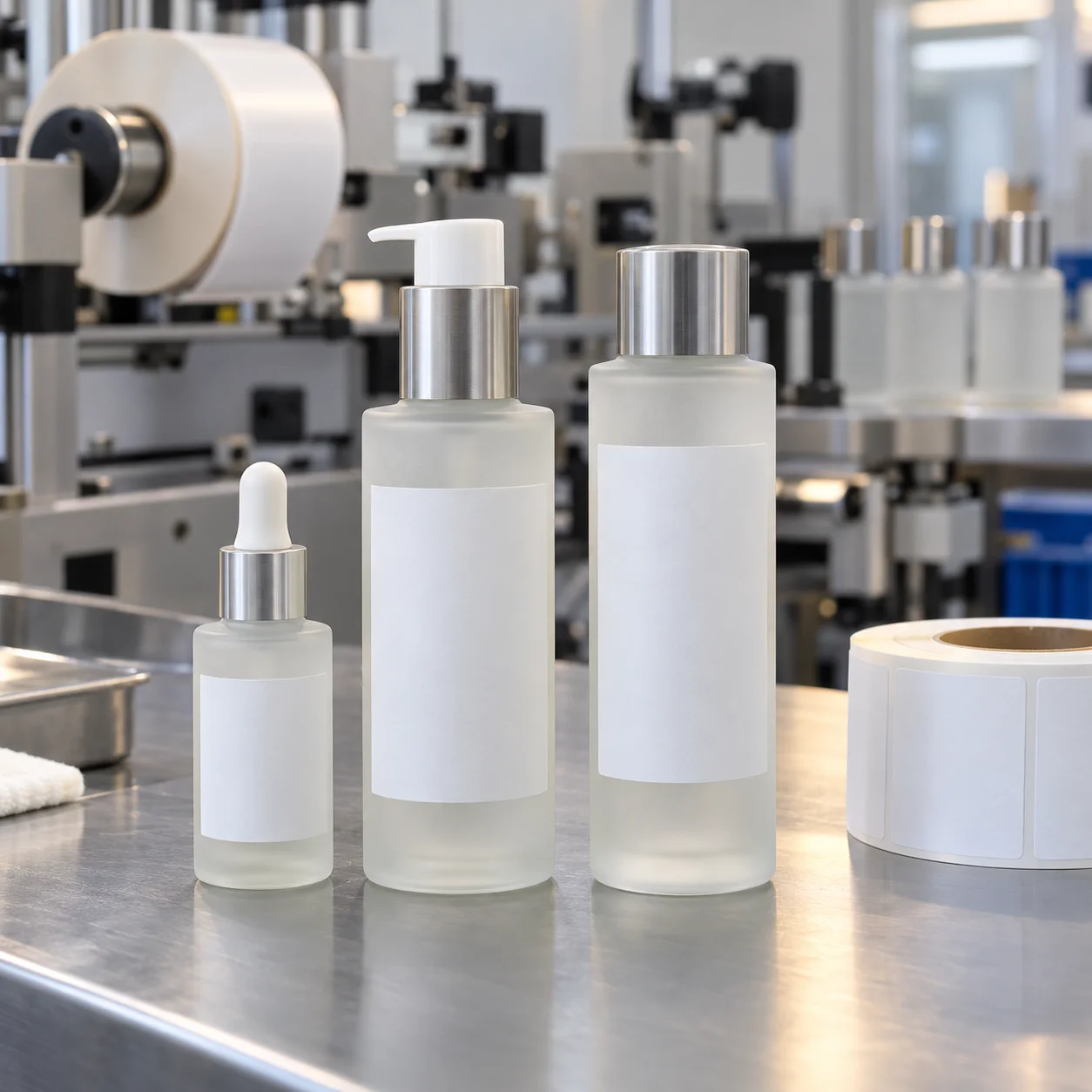
Frosted bottles often have curved shoulders and a narrow straight section. A layout that fits a flat dieline can feel crowded after it wraps. Measure the actual label panel, then place a paper mockup at full size. It is a small step that reveals whether the product name, volume and variant code can still breathe.
Decide whether the label should disappear or stand out
Clear film can give the impression that artwork is printed directly on the bottle, but pale type can lose contrast over frosted glass. White film creates a more stable base for fine text and soft colors. Neither approach is automatically premium; the better choice depends on the brand hierarchy and bottle color.
Think about the whole routine
A serum dropper, lotion pump and toner bottle may share one shelf but have different usable label areas. Build one stable system—logo, type scale and variant rule—then adjust the label shape for each container. That is usually more effective than forcing one exact label size onto every bottle.
Finish should follow function
Matte laminate supports the soft look of frosted glass. Gloss can add contrast where a clean, brighter result is wanted. For bottles used in bathrooms, discuss a material and adhesive construction designed for the expected handling and moisture. For a broader comparison, see waterproof label material options.
Make the proof do the hard work
Review the proof beside a bottle photo or sample, not just at screen size. Check label edge spacing, cap clearance and the visual weight of the label against the frosted surface. This page is best for beauty brands that want a quiet premium look; brands seeking a bold shelf block may be better served by a more opaque, high-contrast label.
Need labels for frosted cosmetic bottles?
Send bottle dimensions, artwork and quantity for material guidance and a free digital proof.
Request a Bottle Label Quote