A pale gradient can fade smoothly on screen while leaving an unresolved transition in a flexographic production proposal. Before approving the proof, ask how the intended workflow represents the lightest printable area and its transition to no ink. Evaluate that boundary on the actual design, rather than copying a minimum tint from another job.
The purchasing decision is whether to preserve the fade through a supported production arrangement, revise the graphic or choose another supported route. A numerical minimum by itself does not show how the brand's pale botanical image will look on the selected construction.

Mark the transition that matters to the design
Ask the designer to identify where the fade should disappear, which details must remain and what an unacceptable visible edge would mean for the artwork. Use the final-size image or illustration, not a generic gray ramp as the only brand reference.
Distinguish the source artwork from the proposed output. A percentage in an image file, a dot on a plate and the printed appearance do not automatically describe the same physical result. Have the competent prepress party explain which stage each supplied value concerns.
Esko's Imaging Engine documentation describes minimum-dot handling and notes that highlight cleanup can affect detail. Its settings depend on the screen and plate arrangement. The version-specific documentation supports asking about that relationship, not adopting its software defaults as a cosmetic-label specification.
Get the relevant production proposal
Ask the converter to identify the intended flexographic arrangement and the supported treatment for the marked gradient. Let its prepress and platemaking specialists determine relevant parameters. Procurement should not prescribe a minimum percentage, curve or screening setting from a web article.
Identify the selected construction, ink arrangement, white backing where relevant and finish. Ask which sample or proof represents the proposed result and what it leaves unresolved. A highlight seen on a white presentation sheet may not answer the same appearance question as the intended finished label on a colored bottle.
If the proposal contains technical terminology such as first dot or a highlight correction, ask what that term means in the supplied workflow. Preserve its definition and scope. Two identical-looking numbers can refer to different stages or assumptions and should not be compared without interpretation.
Commission a boundary review, not just a prettier proof
Give the technical party the marked artwork and the brand's intended transition. Agree the evidence needed to judge it. That might include a relevant production reference or representative sample, as defined by the competent parties. Do not describe a screen simulation as physical proof unless its actual scope supports that claim.
When reviewing the result, examine the specified fade region as well as the whole design. Record where detail is retained, lost or changed according to the agreed reference. If the sample differs from production, identify the difference and ask whether the conclusion can carry forward.
Keep any revised artwork identifiable. A designer may prefer a deliberate stopping edge, a changed tonal area or a simpler motif once the proposed result is understood. Those are brand decisions, not merely technical cleanup. Recheck the replacement export and its relevant output proposal.
Use a highlight-transition agreement
This editorial sheet connects the image's intention to the proof and release. It does not define a press curve or a printability standard.
| Field | Input to identify | Decision supported |
|---|---|---|
| Brand intention | Marked fade boundary and essential pale detail | What must remain recognizable |
| Source | Exact artwork revision and affected channels or objects | Which image is under review |
| Output proposal | Named workflow and technical owner | How the light region is intended to be reproduced |
| Technical terms | Stage and meaning of any supplied minimum | Whether numbers can be interpreted together |
| Evidence | Relevant sample or proof and construction scope | What the reviewer can actually judge |
| Disposition | Preserve, revise or investigate another route | Which design and production proposal may proceed |
Start with the visual intention and current file. Obtain the technical proposal and suitable evidence, compare the marked area and record the chosen route. If the artwork changes, connect the new file to the updated proposal. Do not keep approval attached to the abandoned image.
Stop the affected release when the intended fade is undefined, the numerical recommendation has no workflow context or the proof cannot represent the question being approved. A more confident email is not a substitute for the missing reference.
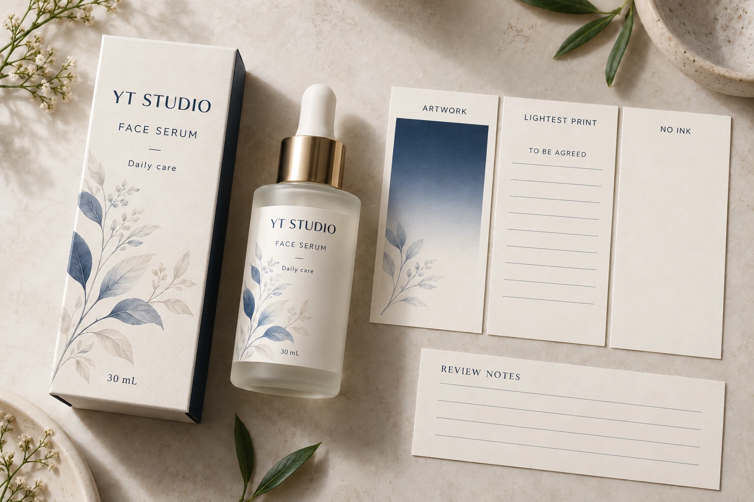
Different design priorities can justify different answers
Consider a hypothetical hero illustration whose soft edge carries the brand's intended appearance. The team may have a reason to investigate a supported workflow and obtain a relevant sample before simplifying the image. The review should focus on that edge, not on an unrelated full-tone swatch.
Now consider a faint background ornament whose precise fade is unimportant. A deliberate artwork revision may be the proportionate choice. Spending extra review effort to preserve an accidental trace can solve a technical question that has little value for the pack.
Neither case justifies claiming that all pale gradients fail in flexo or that one advanced workflow guarantees every design. Ask what the selected proposal can support and let the brand choose with the evidence available.
Keep adjacent prepress questions distinct
The minimum-feature guide covers physical text and line details. The image-resolution guide covers available raster information at the placed size. Neither supplies the workflow-specific answer to a fade approaching no ink.
A color-difference agreement also has its own reference and measurement scope; see the Delta E tolerance guide. A small reported color difference in a selected patch does not, by itself, approve the appearance of the gradient's boundary.
For a cosmetic label inquiry, provide the container, dimensions, quantity per artwork, intended construction and current export with the pale region marked. Describe which detail and transition matter. The form prepares a message; send files separately by email or WhatsApp. Ask what production proposal and evidence can support the light end of the design.