Set the non-negotiable design elements
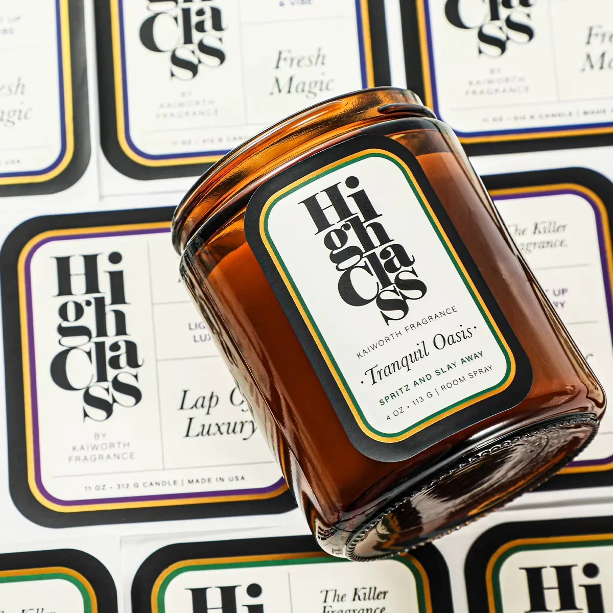
Choose the elements that remain constant across every scent: logo position, primary typeface, jar label size, information order and a small set of finish rules. This gives a collection a recognizable shelf presence even when individual fragrances have different names or colors.
Use variants to create difference without clutter
Scent name, a color band, a subtle illustration or a numbered system can differentiate each SKU. Limit the number of variant devices, especially on smaller jars. A buyer should be able to identify the fragrance in seconds without losing sight of the brand.
Design for the real jar, not a flat mockup
Amber glass, clear glass, matte tins and textured boxes all affect how color and foil read. Check the available panel and label edges against the physical container. If the candle has a warning or instruction label, reserve a separate placement from the beginning. Market-specific safety content should be approved by your responsible compliance team.
Choose finish after the hierarchy is working
Foil, clear film, kraft stocks and matte laminates can strengthen a design, but they cannot rescue a crowded layout. Finalize the type size, contrast and spacing first, then select a finish that supports the brand position. Our candle label finishes guide compares common options.
Proof the whole family together
Review all scent variants side by side before approving print. This exposes inconsistent color values, misplaced marks and labels that feel too similar. Include jars, cartons and gift packaging when possible so the final collection tells one coherent story.
Planning a candle label collection?
Send your jar photos, scent list, artwork and quantity for finish suggestions and a free digital proof.
Request a Candle Label Quote