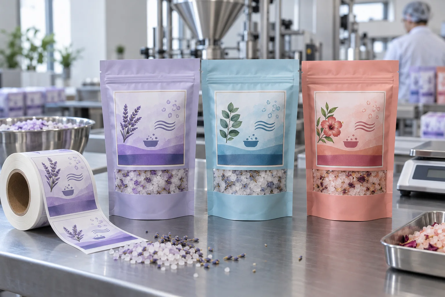
Find the panel that stays visible after filling
Mark the top seal, gussets, zipper or tear zone and the front area that stays flat once the pouch is filled. The proof should be reviewed on a filled sample, because creases change both graphic balance and information visibility.
Use an original visual system for variants
Salt crystal dots, water waves, botanical marks and a restrained soak icon make practical variant cues. They tell the product story without turning the label into a borrowed look. Keep one shared grid while colour differentiates scent or mineral families.
Give the front and back different work
Let the front establish the range and variant; use the back for the detail that needs more room. A pouch becomes more premium when it stops trying to say everything from one angle.
Check adhesive against the pouch film
Flexible pouch surfaces vary in gloss, texture and movement. Film label materials and protective finishes may be considered, but the final construction should be checked against the pouch laminate, filling conditions, salt exposure, storage and application method.
Keep clear windows and labels in balance
If the pouch has a transparent window, it already supplies texture and product proof. Do not bury it under a label. Use the designed panel to guide the eye, then let the visible salts provide the second reason to look closer.
Proof the retail-facing set
Check the pouch standing, grouped with other variants and inside any carton. Supply pouch dimensions, artwork, finish preference and quantity. For another flexible personal-care format, see our refill pouch label guide.
Need bath salt pouch labels?
Share your pouch details, artwork and quantity for practical label options and a free digital proof.
Request a Bath Salt Label Quote